Tuesday, 17 December 2013

Planning and Analysing masthead

In order to start planning my masthead, I used adobe photoshop to create 6 possible mastheads for my magazine. As the magazine focuses around the 60's/70's era and the psychedelic music which was the anthem at the time, I tried to make my fonts as psychedelic as possible.
This is the first masthead I created. It contains a kaleidoscope of different colours, which links in very closely with the whole 'hippie' theme.
This is the second masthead I made. I have made the text mint so it links in with the colour scheme that I am planning to use in the magazine. The drop shadow will also let the text stand out.
This is my third masthead. I have used the same effect that   I used on my first design, but instead I decided to lighten the satin effect, resulting in a pattern which looks like a sky filled with clouds. Some people may also think that the pattern looks like smoke, which links in with the use of incense/cigarettes. I have also used an outline in order to stand out as much as possible against the light colour of the inside of the font.
This is my fourth masthead. This one also contains hints of a psychedelic spectrum of colours, but the main colour is a mint green, meaning that it will also fit in with the colour scheme I am going to use.
This is my fifth masthead. With this masthead, I have tried to make it look as similar to the text used on the Beatles album cover 'Magical Mystery Tour' as possible. This font clearly contains a wide selection of bright and vibrant colours, which will help draw in the attention of passers by. The thick black outline will help the masthead stand out immensely.
This is my sixth and final masthead. The main colour used is a mint colour, meaning this font like many of the others I have created will fit in well with the colour scheme I want to use in my magazine.

I finally decided that none of the fonts above looked professional enough for my liking so I decided to download a 'groovy psychedelic' font from the internet and transform that into a logo/masthead that I would like. 


I believe this final design was the most striking and mostly psychedelic of all of my attempts.

Monday, 16 December 2013

Magazine Profile

The price of my magazine as mentioned earlier will be £2.75, which I think is a reasonable price for a monthly released magazine.
I would like my magazine to be available to buy in all supermarkets such as Tesco, ASDA, Morrisons, Sainsburys, WHSmith's etc. I would also like it to be sold in music orientated stores such as HMV.
The magazine will contain many different articles in every issue including:
  • "Track of the month" - a specially selected track from the archives accompanied by background information and facts
  • "Album of the month" - a specially selected album from the archives containing interesting facts and figures
  • "Artist of the month" - an artist or band from the era who has influenced one of the media team profoundly this month. This artist will most likley be the same artist which is displayed on the front cover or talked about in the main story. This article will contain all of the basic information about the band/artist which is not displayed in the main article.
  • Tour Dates - for the bands and artists that are still around, we will provide a list of tour dates so people have the chance to go and see their legends play
  • Desert Island Discs - I will try and catch up with some of the most influential musicians from the psychedelic scene and ask them to name 5 tracks that they would take with them if they were to be stuck on an island for the rest of their lives.
I have also decided to call my magazine 'Psyched' which is shortened version of the genre of music my magazine focuses on and also means 'to be excited' which will suggest to my audience that my magazine is new and exciting.

Audience Uses and Gratifications

People who use my magazine would use it to escape from the daily troubles and woes that today's modern society throws at us. The magazine as a whole focuses on music of past generations, and although the magazine will be heavily influenced by music, it will also contain information and references to life in the 60's/70's, helping them to vividly imagine what life was like generations back.
This also links in with the use of wanting to be informed and educated. The magazine will contain lots of information on the artists and how music was made etc, which will hopefully be new information to my readers.
Although they are not in my target audience, middle aged men and woman could read my magazine and revoke childhood memories of living in those era's, helping them to recover long lost memories and hopefully lead to them being entertained.

Monday, 2 December 2013

Recommended conventions as a result of the questionnaire

In the results of my questionnaire, I found out a lot of important information about my target audience who would be reading my magazine:
I found out that 45% of my interviewees read the magazine NME, and 0% of my 40 resultees have ever read Uncut. This suggested to me that I make my magazine contain similar conventions and layouts as NME rather that Uncut, as people are obvioulsy impressed by the way NME presents itself by the percentage of people who read it.
When I asked my target audience how often they read magazines, the highest percentage of them replied with 'I never read magazines' (30%.) As I actually need to create a magazine, I looked at the other two highest ticked answers, which were 'Once a month' and 'Once every 2-3 months' (both 22.5%) As a result, I decided to make my magazine a monthly release.
I gave my audience a list of artists who fit into the 60's-70's psychedelic/rock vibe to see how many had heard/listened to them. Out of the all the artists I had given them, atleast 6 people had heard of each artist. The artist who people had heard of/listened to the most was The Rolling Stones, gaining 95% recognition. The artists who have large percentages would be mentioned in my larger articles whilst the artists who had little recognition would be mentioned in small articles such as 'artists you should listen to' etc.
I asked people 'Which features of a magazine do you personally find appealing?' I recieved many different responses, but many people found features such as the colour scheme, the font, the main image/cover artist and the articles involved to be some of the most important features. I have decided to chose my colour scheme carefully in order to appeal to as many people as possible and I will also focus on making my articles and main artist images as exciting as possible, in order to wow my audience.
I then went on to ask my audience which colour scheme they would prefer: fresh mint, crushed plum, mellow yellow or baby blue. The two colours which recieved the most votes were fresh mint and crushed plum, both at 35%. I have decided for my colour scheme to revolve around different shades of mint as a I find the colour mint appealing and I believe no other magazine out there contains that colour scheme, making my magazine stand out from the crowd.
I then went on to ask them how much they would pay for my magazine. I gave them many different price ranges, from £0 to £5.00. The price range which recieved the most votes was £2.51 to £3.00, so I have decided to price my magazine at £2.75.
As a final question, I asked my audience if they prefered it if the magazine focused more on the celebrities or the music, or a bit of both. The answer which recieved the most votes was an even mixture of both (55%) meaning I will make sure my magazine contains an even mixture of articles focusing on the music and the celebrities behind the music.
As the magazine is heavily influence by music from the 60's/70's era, the font I will use for my masthead will be as groovy as I can make it.

Any futher secondary re-search

Similarities between the similar products I re-searched and annotated:

All the magazines contain autumnal colours such as red and orange, which portray a sense of danger and he 'reckless' lifestyle of  most of the celebrities mentioned in the magazines. Each of the products at one time or another focuses on artists who made their debut/reached their ultimate peak of fame in the 60's, and the main artist on the covers of the magazines I annotated madr their debut in the music industry decades ago. Each of them contains a striking bold logo in the top let hand corner of the cover page. Each of specific font covers I annotated also contained the names of the artists who the articles inside the magazine focused on as coverlines. Most of the double page spreads contained a full page picture of the artist who the article focused on, whilst the second page contained the article and text itself. Each of the contents pages also contains a section which informs the reader of the hottest articles and topics in that issue, whether it be the cover story or special features included in the magazine, and the page numbers associated with them.

Tuesday, 19 November 2013

Questionnaire Results

After I got all of the results from my questionnaire,  I decided to present my results in an interesting and exciting way

Questionnaire

In order to gather information about all the different codes and conventions I should use in order for my magazine to be as successful and as appropriate as possible, I created a questionnaire to get a clearer insight into my target audiences views.

Link to questionnaire: https://www.surveymonkey.com/s/QS5BQRM

Target Audience Profile


Monday, 21 October 2013

Initial Thoughts

My initial thoughts about the magazine are very positive. Music is a media form which I am very passionate about, so this task will be fun to complete. My music taste manly revolves around the 60's vibe of the Beatles, the Rolling Stones, the Kinks, Bob Dylan, the Small Faces etc, so my magazine will be influenced and based around the 60's/70's scene. 60's music also links in with psychedelia due to the 1967 'summer of love' and the release of the highly 'trippy' albums such as 'Sgt. Peppers Lonely Hearts Club Band', 'Their Majesties Satanic Requests' and 'The Piper at the Gates of Dawn' so my magazine will also be focusing on the psychedelic scene also. My magazine will have similarities to magazines like 'Uncut' and 'Mojo'. The target audience for my magazine will be teenagers, due to the fact I believe there are many teenagers now interested in the 60's scene and the magazines aimed at them in this day and age are all focused around the latest pop music which not all of us are keen on.

Main Task Brief

For my task brief, I have been asked to create a front page, contents page and a double page spread for a music magazine. I can choose the genre of music, colour scheme and every other aspect of the magazine. The finished product has to contain a minimum of 4 original images which I have taken myself, which focus around music to help link in with the music theme of the magazine.

Wednesday, 9 October 2013

Evaluation and Reflection

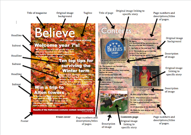
My school magazine uses conventions used in other real media products by using a similar layout as many famous and iconic magazines. I have also done this by using distinct and essential parts of a magazine, like headline, tagline and footers for example.

One of the biggest challenges I have used is by including childish drawings and images on the front cover. In my target audience profile, I stated that my target audience is middle-aged parents of children and the school, who most people assume would not be fond of the use of childish drawings. You have to remember that it is a school magazine, which means that students of the school will also read the magazine and as well as appealing to the parents, it needs to appeal to the children. Also, childish drawings never hurt anyone, in the sense that parents may find these cartoons humorous.

One way my product represents particular social groups by using unconventional tactics in my magazine, like the use of cartoons or the humour used in the headlines/page descriptions. It is the stereotype that people within the A-B higher earning social grades have little sense of humour and care very much about their child's education and do not want to be given any sort of 'riff-raff.' As we saw whilst analysing the school magazines of existing schools, the front covers and contents pages of private and boarding schools were very plain and regimented. In contrast, parents in the C grades and stereotyped as being as having a much more 'laid-back' approach to parenting, and don't sensor their child's lives and make the world seem a lot easier and better than it is. This is why my magazine contains bright colours, pictures and drawings and humour. The parents of the students of the school aren't the most wealthy of people, which is why I believe my magazine would appeal to them.

I think the only institution able to distribute my product would be the school itself. Taking inspiration from what my school does with their termly magazine which is send out the magazine to the houses of the students, I think this is a act i would consider. Another option would to be to supply the local newsagents of the town with the magazine, so local parents or even students can go and pick up a copy from their local convenience store.

I attracted my audience by using headlines such as 'win tickets to alton towers.' In this currently struggling economic climate, money is scarce, so a free trip to alton towers would certainly have the parents of students picking up a copy for a chance to win.
During the construction of this product, I have learnt how to work and run a blog, a skill which might come in handy when I go to university or if I ever decide to just create a blog. I have also learnt how to convert a word document into a JPEG, which will also be very handy when creating documents in the future.

If I were to redo this project again, I would change my target audience. Although I still believe parents lack an understanding of what exactly goes on in their child's school, I think I should have made the target audience children at the school. My magazine as it is, with all the vibrant colours and cartoons and such, is already more suited for a minor audience.

Also, I would manage my time a lot better and make sure I got tasks finished in the weeks they were supposed to be. I found myself not being able to complete tasks on time and finding I was completing tasks that should have been finished up to 2 weeks ago. Next time, I would be determined to finish each weeks work/tasks in the week they were agreed to be finished.

Final Contents Page


Final Front Cover


Draft Two Completed and Annotated


Audience Feedback

My target audience is people in their late 40's - 50's so I asked my parents what they thought of my magazine.
They told me that my front cover contained a lot of blank space which could be filled with more images.
They said that the magazine didn't contain the school's name or logo which they thought would be needed.
They also said that there wasn't a clear distinction between the page numbers and the page details and that I should make the numbers bold or make the text size for the numbers bigger.

Monday, 23 September 2013

Flat plan for magazine front cover and contents page


Target Audience Profile

An example of one of the typical and intended readers for my magazine would be Margaret. Margaret is 46 and has a husband called Jim. She works in a call centre, earning an average of £19,000 per year. She has 4 children, 2 of which attend the school whose magazine I am creating. She is white British, lives in the UK and is living in the C social grade. Margaret has not found the religion right for her but is open to religion when the right one comes along. She has no specific political views but if she believes in what a party is promoting and promising, she will vote and follow that group. Margaret has many hobbies, including knitting, playing ker-plunk with her children and baking cakes. Her husband Jim works night shifts, meaning the house is always spotless as he has nothing to do in the daytime, leaving her time to put her feet up and have a read of the latest newspaper (or school magazine).

Annotated Front Covers and Contents Pages


Action Plan


Initial thoughts and Ideas

My thoughts about the project are very positive. The project contains creating a front cover and a contents page which I enjoy as it gives me a chance to put my artistic and technologic capabilities to good use. The task also involves me using my own images, which I will enjoy doing as I have a keen interest in photography. I would like my magazine to focus on the big events that have happened in the school in the last quarter, like many other school magazines. My magazine will be aimed at the parents of the students at the school as I believe in many cases they lack understanding of the events and goings-on of their children’s schools. I am going to use Adobe Photoshop to edit my images as it is one of the most specialized pieces of software going and will make my images look more professional. I am going to avoid using any sort of word art of the font ‘comic sans’ in my product as it is very basic and portrays a sense of amateurism.

Preliminary Task Brief

For this task, I have been asked to create a magazine front cover and contents page for a school magazine. To do this, I will need to re-search current school magazines, searching for inspiration by looking at layout and appropriate colour schemes etc. I will also need to create a 5 week action plan, giving my self certain tasks to do each week in order to complete the task within the given time limit. The finished product will also have to contain 4 original images (1 main image and 3 supporting images) so I will have to decide on appropriate images I would want it to feature and take them with my camera in my own time. Lastly, I will need to create a target audience profile in order to decide on appropriate themes to suit the intended reader.