Wednesday 2 April 2014


Friday 21 March 2014
Analysis of technology used
In order to create my magazine, I used various different types of technology. In order to capture my images, I used my own 12 megapixel Nikon camera. Using this technology helped me when taking my pictures as I was already well educated with the process of using the camera, helping me to get the desired effect I wanted. All of my work was created on the apple mac's using the program Adobe Fireworks. This is a program that I also knew how to use already, allowing me to create my magazine quickly and efficiently due to no time being issued to learning the ins and the outs of the program. Knowing the program well also allowed me achieve 'higher than basic' effects on my magazine, helping my magazine to look more professional.
Wednesday 19 March 2014
Edited Images
For my magazine front cover, contents page and double page spread, I had to take my own original images to use. I took a picture of myself with my hand across my face. The picture has been edited heavily using effects such as gaussian blurs and hue changes. I added the blur to make it look like the character was undergoing some sort of 'trip'. I also changed the hue and saturation to give the picture more of a psychedelic feel, and fortunately this hue change made my character mint and plum, the two colours I am using within my magazines colour scheme.

The next picture I used was also a picture of myself similar to the one on the front cover, as the double page spread focused on that exact character. In this picture, I am facing the camera which allows the reader to view my eyes, which have also been affected by the hue, turning them a pinkey-purpley, which links in with the trippy 'hippy image I am trying to portray to my audience.

The other picture I use on the double page spread is another picture of myself (my main character Ruby Tuesday). In this picture, I am looking away from the camera. The hue change is this picture is different from the other two images, showing you that I am in a different stage of the 'trip' I am on, linking in with the looking away from the camera. The positioning of my character shows a better view of the bowie-esque lightning bolt that I drew on the side of my face, showing that there is something peculiar and quirky about the celebrity I am interviewing.

For my double page spread, I created the cover of the CD that my character was trying to promote through her interview. In the picture, my character is positioned looking out onto a field. I have changed the hue of the picture to make the sky a bright pink colour, giving the effect that I am in another world along with a psychedelic feel.


The last image I used on my magazine was a picture I took of some of my vinyls that fitted in with the psychedelic rock/60's vibe that my magazine focuses on. The pictures are arranged in a messy fashion to give the effect that someone has chucked them down and placed them randomly, bringing back childhood memories of the teenage years of the older generation who read our magazine.

The next picture I used was also a picture of myself similar to the one on the front cover, as the double page spread focused on that exact character. In this picture, I am facing the camera which allows the reader to view my eyes, which have also been affected by the hue, turning them a pinkey-purpley, which links in with the trippy 'hippy image I am trying to portray to my audience.
The other picture I use on the double page spread is another picture of myself (my main character Ruby Tuesday). In this picture, I am looking away from the camera. The hue change is this picture is different from the other two images, showing you that I am in a different stage of the 'trip' I am on, linking in with the looking away from the camera. The positioning of my character shows a better view of the bowie-esque lightning bolt that I drew on the side of my face, showing that there is something peculiar and quirky about the celebrity I am interviewing.
For my double page spread, I created the cover of the CD that my character was trying to promote through her interview. In the picture, my character is positioned looking out onto a field. I have changed the hue of the picture to make the sky a bright pink colour, giving the effect that I am in another world along with a psychedelic feel.
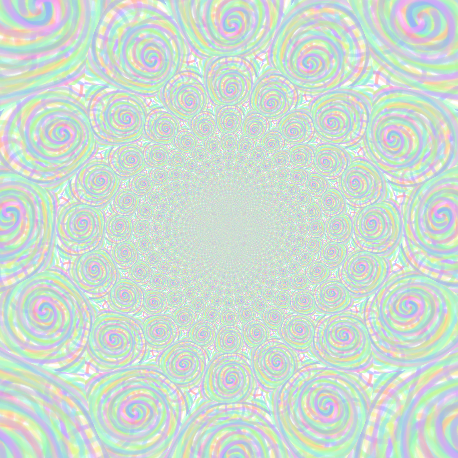
For my contents page, I needed a large image to take up the half right side of the page. I used this picture of my friend katie and added a 'trippy looking swirly' background to it. I created the background by drawing spirals on fireworks and then using the kaleidoscope effect on pixlr. I then lowered the transparency and added it as the background to the original picture of katie. I then shifted the kaleidoscope layer slightly to give a thick border on the right side of her face. On the contents page, I flipped the picture horizontally.
The picture below is the original spiral I made on fireworks.
The picture below is the picture once the kaleidoscope effect had been added.
The picture below was used as the background for my front cover. The picture is of a painting found inside the Beatles story museum in Liverpool. The picture fits in completely with the whole theme of the magazine.
For the picture to fit in with the rest of the front cover, I had to make a few changes. I changed the hue to create an even more intense trippy and hallucinogenic feel to the picture. I also flipped the picture horizontally I was able to see the woman on the left hand side.
Wednesday 29 January 2014
Pixlr Editing
I had a play around on pixlr to get used to their editing software:


Here is a picture of the Small Faces. The picture on the top is the original image and the picture on the bottom is the picture after I had edited it. The only change I have made is that I have taken the saturation from the picture apart from the boys.
Here is a picture of psychedelic rock legend Syd Barrett. I decided to change the hue of the picture to make it look more 'trippy'. I then opened the picture in fireworks and added a radial blur to make it look like his mind is being altered by the music he is creating/drugs he is taking.


Here is a picture of David Bowie. Like my last edit, I decided to change the hue. I then used an effect found on pixlr called 'kaleidoscope' to create this psychedelic effect.
Here is a picture of George Harrison. To create this effect I used to layers, one the picture of george and one a picture of a psychedelic swirl. I placed the swirl layer behind the picture of george and used a low opacity rubber to rub out the water he is in to reveal the psychedelic design.
Here are two pictures of John Lennon and Paul McCartney. I decided to take the background out of both pictures in order to place both the Beatles together in the same photo.
Thursday 23 January 2014
Practice/Mock Magazine Front Cover, Contents Page and Double Page Spread

This is the mock design for my magazine using un-original images that fit in with the genre of my magazine. For my final magazine, I would like to create a similar magazine using original images iI have taken myself. This is the magazine draft for my front cover.

This is my mock contents page

This is my mock double page spread
Image planning
I want the images that I use in my magazine to be throughly linked to the psychedelic music scene. For my main image on my front page I would like a picture of a character dressed in 60's-like clothing covering a part of their face in someway, in order to portray a sense of mystery and to suggest that the artist is hiding something interesting.
On my contents page, I want a picture of a supposed up and coming artist in the psychedelic music industry. I want this person to stare and smile straight into the camera lens to portray a sense of confidence and positivity. I also want a competition to be advertised on this page for a selection of psychedelic/60's vinyls, so I want a birds eye view picture of an array of roughly scattered vinyls.
On my double page spread, I want a selection of images focusing on the artist featured on the front cover. I want a selection of images taken from different angles to give the reader a 'full view' on the artist in question.
Subscribe to:
Posts (Atom)